As a rebel in the conservative world of art, Jonas Kleerup wanted a distinctive brand identity and visual language that could work alongside the young, unestablished, street-savvy artists he represents.
Challenge
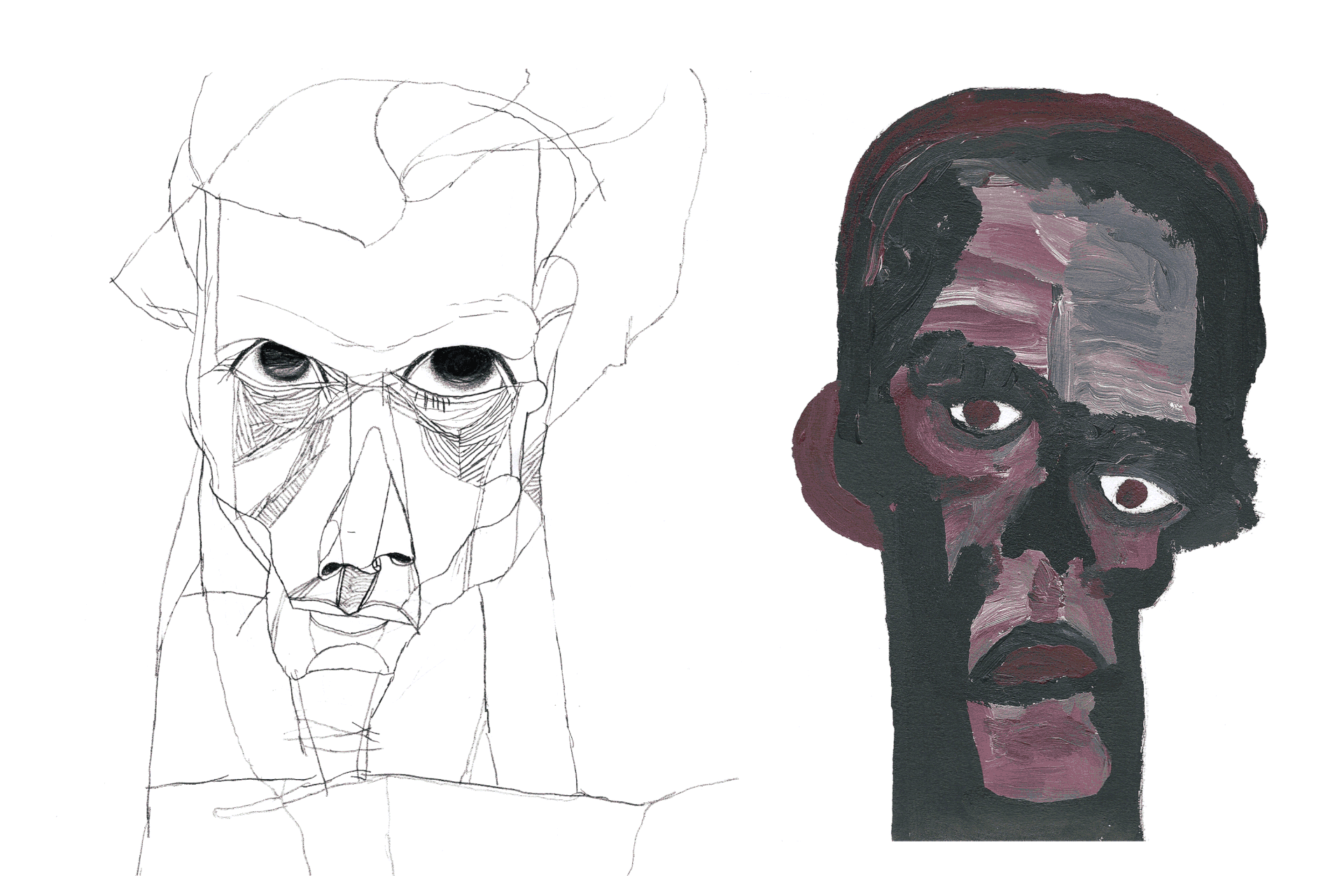
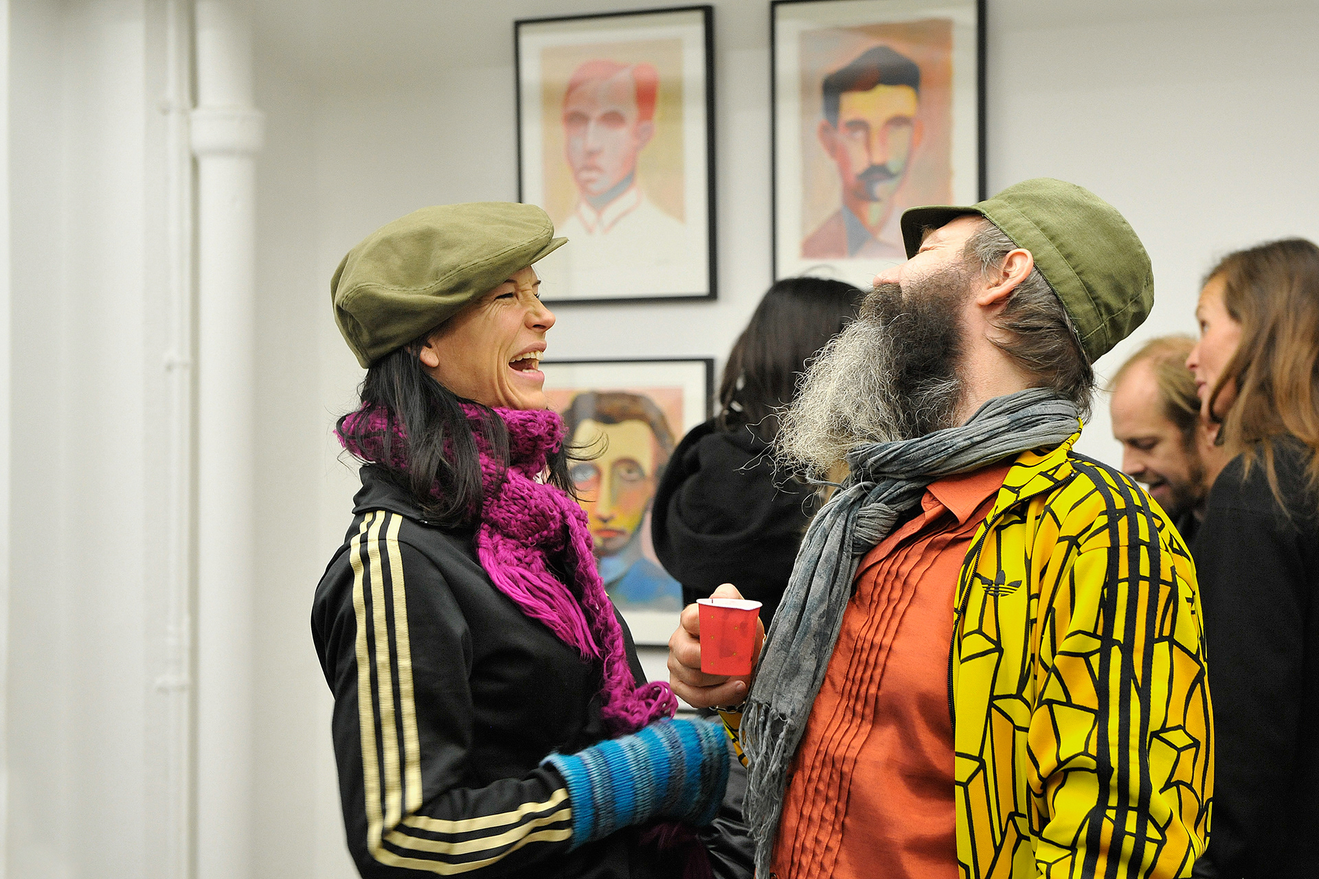
The common denominator of the gallery artists is the young, modernistic and street-smart expression. Just as Jonas Kleerup can be seen a rebel in the conservative art world – so can his artists in their respective genres. Kurppa Hosk was asked to create a suitable visual identity for the gallery.
Approach
In the development of the gallery’s visual identity, Kurppa Hosk decided to reinforce the rebel side – both of Jonas Kleerup’s business and of the artists he represented. Instead of a static design system, mainly focusing on the gallery itself, Kurppa Hosk also wanted to give the artists and their work more attention.
In the development of the gallery’s visual identity, Kurppa Hosk decided to reinforce the rebel side – both of Jonas Kleerup’s business and of the artists he represented. Instead of a static design system, mainly focusing on the gallery itself, Kurppa Hosk also wanted to give the artists and their work more attention.
Outcome
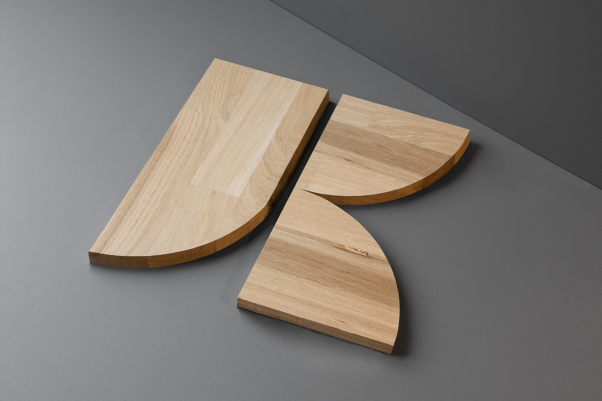
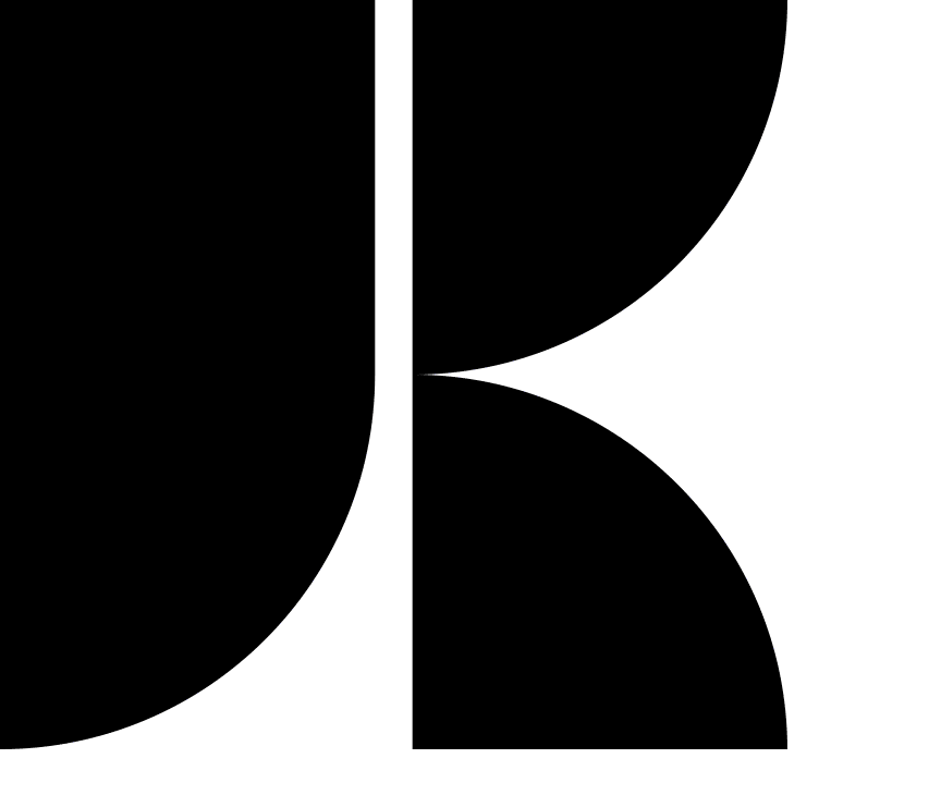
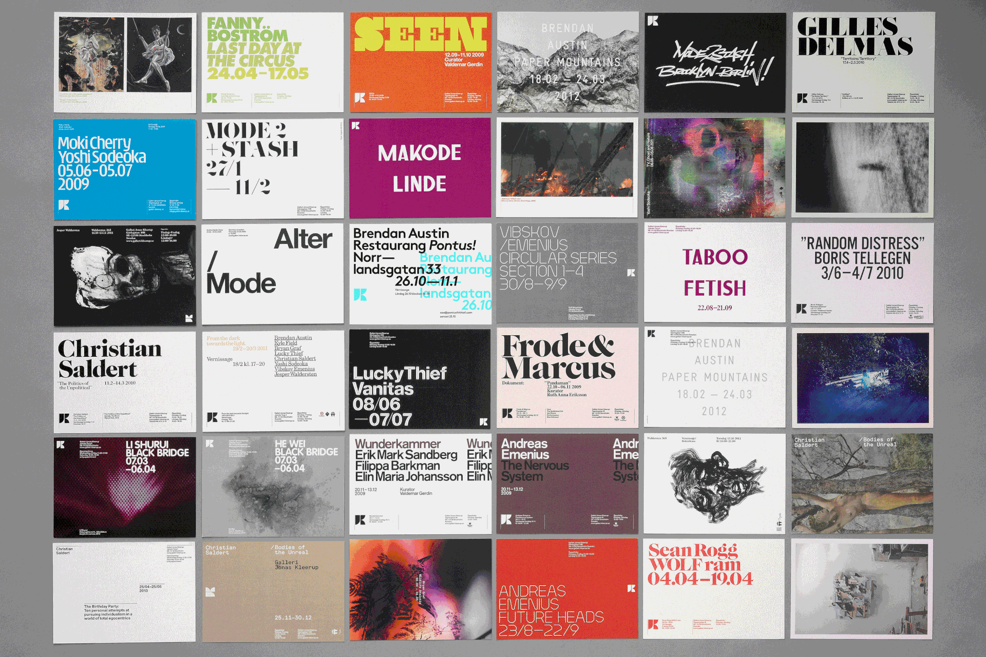
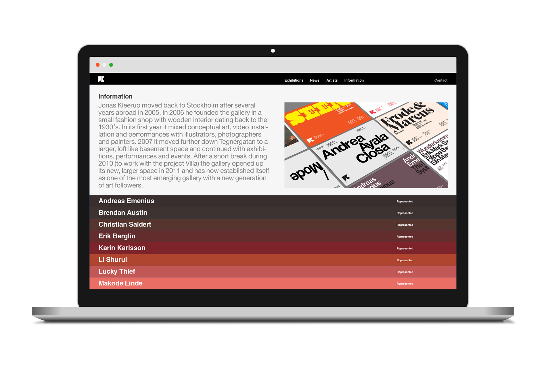
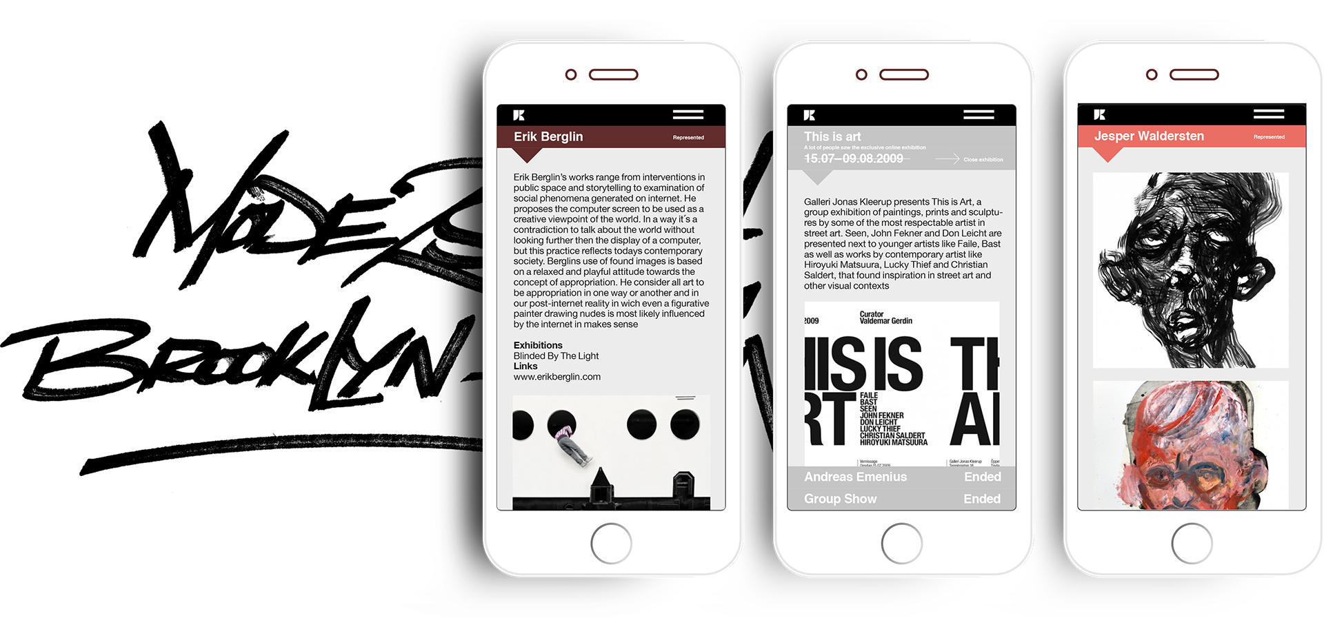
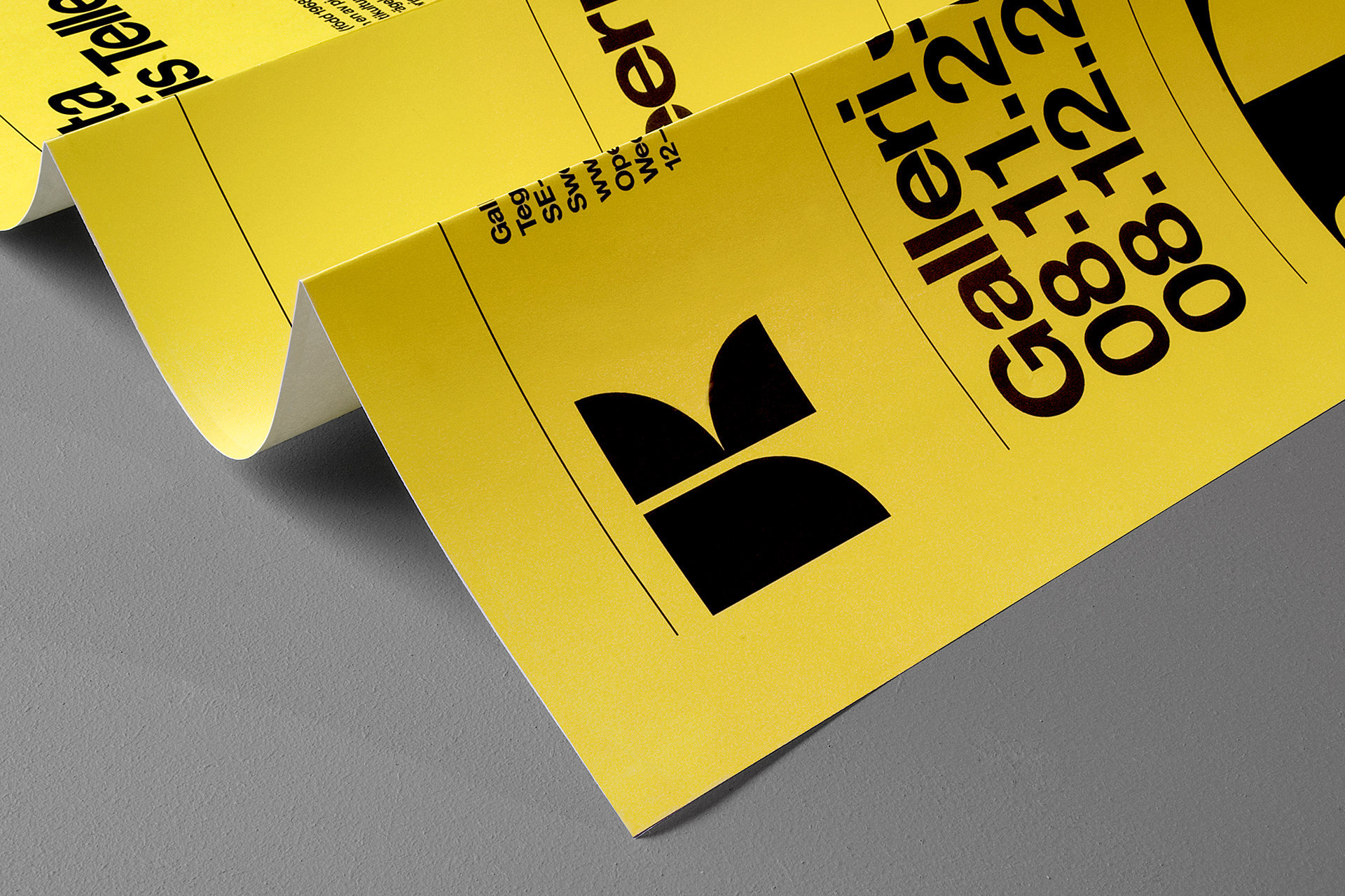
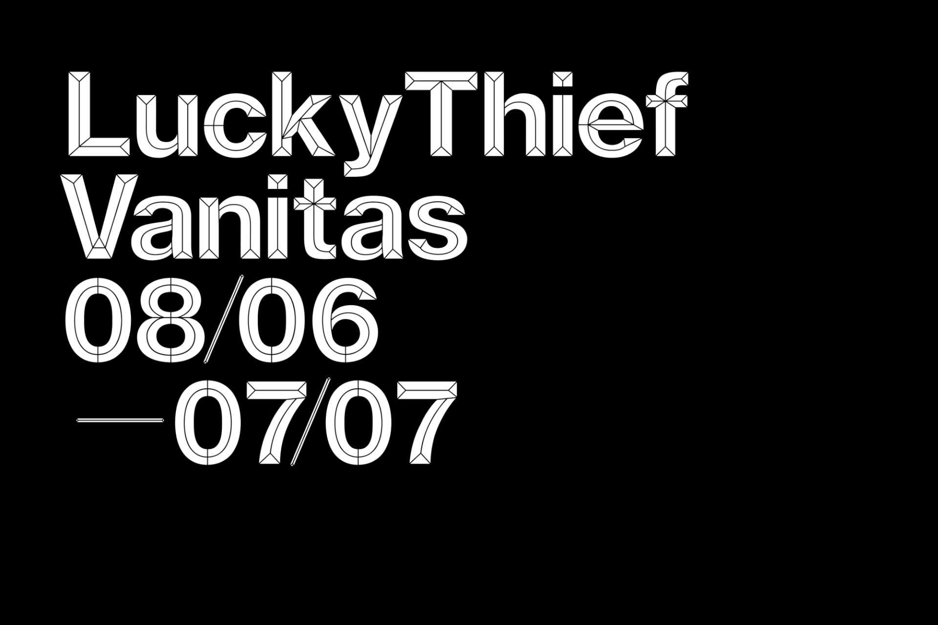
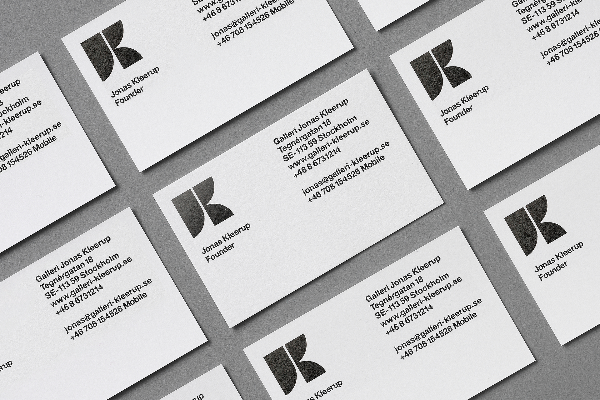
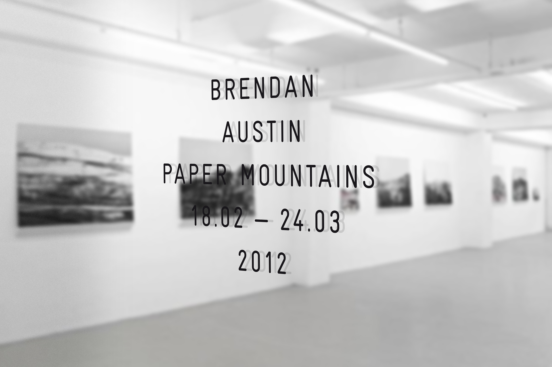
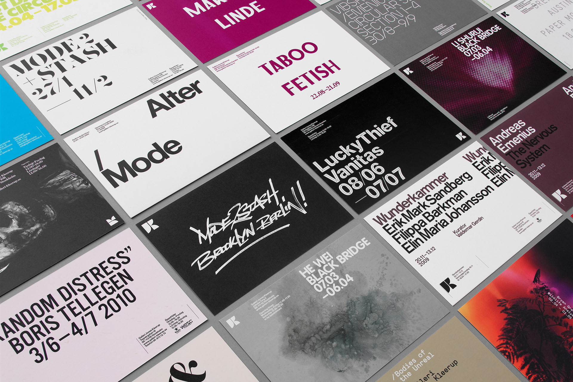
The result was a dynamic design system that allows the visual language to vary with the exhibitions. The logotype is based on Jonas Kleerups initials, “J” and “K”, placed together in a monogram. The rest of the identity is fairly open. Typefaces, colors and images vary over time to go with current exhibitions. The dynamic framework leaves great room for creativity.
The result was a dynamic design system that allows the visual language to vary with the exhibitions. The logotype is based on Jonas Kleerups initials, “J” and “K”, placed together in a monogram. The rest of the identity is fairly open. Typefaces, colors and images vary over time to go with current exhibitions. The dynamic framework leaves great room for creativity.